During the first half of the 1990s, disruptive innovation was the graphic designer's morning cup of coffee. You either grabbed a mouse and rolled with it or found another job.
Washington D.C. in the 1970s was a mess. Protests, rioting in the streets, corruption in the White House. I was coming of age then, and my heroes were Bob Woodward and Carl Bernstein. I wanted to be them and dreamed of one day working at The Washington Post.
I graduated with a journalism degree from one of the country’s top journalism schools and got a job covering police and criminal courts for a small newspaper in East Texas where I soon learned that when you are a student journalist, everyone thinks you’re cute. Not so in the real world. My job was talking to people who didn’t want to talk to me, getting them to say things they didn’t want to say to put in stories they didn’t want to read. Hated it.
Fortunately, the newspaper needed design work and I was good at it. Magazine Journalism with a graphic design emphasis had been my college major. I figured if The Washington Post wasn’t an option, then being an art director for Time Magazine would be a good Plan B.
The Lufkin Daily News turned me loose on advertising, news layouts and a special section on Afghanistan for Cox Newspapers. (Don’t ask. I played a bit part in Charlie Wilson’s War.)
After the Afghanistan section ran, an editor from The Houston Post called and asked if there were any other designers like me interested in a job at The Post. I said no, I’m it in these parts. They hired me as a features desk editor to design the weekly food section. My training consisted of one warning: Whatever you do, don’t use purple. Peter hates purple.
“Peter” was Executive Editor Peter O’Sullivan, a 5’ 8” powerhouse of a man with a lovely British accent who wore crisp white shirts and a tie to work every day. He would barrel across the newsroom clicking the cap of his retractable pen in search of an editor to pounce on for some egregious infraction. I had a huge crush on him.
Then the unthinkable happened: Plums. I had to do a food section on plums. You can’t design around plums with any other color than purple. So, what the hell - I used every shade of lavender possible. Our presses could handle lavender and it looked good. My boss looked at me, shook his head and said Peter’s going to hate it.
At the next day’s staff meeting, Peter held up two section fronts. One was mine with purple splashed all over it like some horrible plum crime scene. The other had bits of dark reddish brown and maroon, not a good look. This was it, I thought and braced myself for the end of my short newspaper career. Peter waved the brown and maroon page at the room and bellowed out that he never wanted to see purple again in The Houston Post. Never. Then he held up my page and said: “This. This is good. We need more like this.”
Who knew? It seemed Brits call maroon “purple.” After that, they gave me all the section fronts to do every week, some special news sections and one day promoted me to design the Sunday magazine. The Associated Press and various press clubs gave me lots of awards.
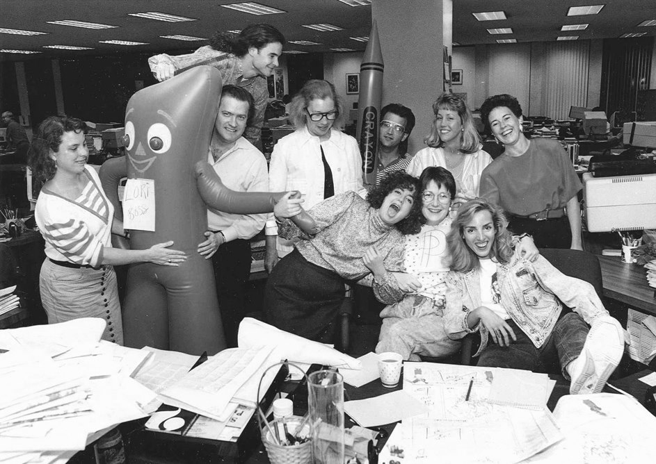
The Houston Post newsroom, May 1990. We would mark up page proofs, yell "COPY" and hand them off to copy boys who would get the proofs to the composing room floor. If I wanted to preview the page, I walked two floors down to the color production room, borrowed the separation proof and took it to the composing room to eyeball it over the columns of type being held in place by hot wax on the production form.
Eventually I would be lured away from the newsroom by a regional magazine that promised me trips to direct fashion shoots in Paris and Tokyo and a nice corner office overlooking the Galleria. Back then art directors traveled with their creative teams. I commuted between Manhattan and Houston and lived at the St. Regis while in New York. It was the dream job.
Until it turned into a nightmare. I discovered the magazine was having financial problems when we couldn’t afford to hire a driver to drive the location bus for a shoot on Long Island. So I drove the bus . . . during rush hour, all the way through Manhattan. Then I ended up paying half a year’s salary to cover the team’s hotel bill. And Paris? Never happened. We managed to fake it in Castroville, Texas.
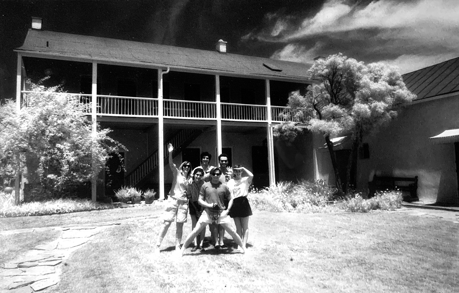
Castroville, Texas. The photography team and I stayed at the Landmark Inn, a state historic site. It wasn't Paris, and Paris couldn't touch the reception we got from this small town outside of San Antonio. We were treated like celebrities. Of all the places I've been, Castroville remains my favorite location for a photo shoot.
So it was back to the newsroom, this time to The Dallas Morning News, to design – you guessed it – more food pages. Every Tuesday I styled food pictures in the paper's newsroom studio, working with a fierce photographer who often railed on camera companies for designing equipment suitable only for male hands. Natalie warned me to watch out for meat, “Big hunks of meat. They’re ugly – they just sit there and you can’t do anything with them, with light or styling.” I secretly thought that was her take on men, too.
As Thanksgiving neared, I learned what she meant. Turkeys are not naturally photogenic. When they come out of the oven fully cooked, the skin is shriveled in awkward places, browning is uneven and the appendages splay out. To get that beautifully plump bird, you cook it partially, just until the hot flesh steams the skin and blows it out, like a balloon. Then you turn off the oven and let it cool. Next you paint it with light layers of soy sauce (yes, soy sauce, a food stylist’s staple) until it is a beautiful, rich, caramel color, darkening in all the right spots. Don’t believe it? Google “Thanksgiving Turkey” and see if you can spot the real birds from the fakes.
Now you know why your turkey never comes out of the oven looking like the ones advertised. Just be glad yours is fully cooked. Raw turkey flesh under hours of hot studio lights produces a stench that only a coroner could tolerate. Maybe.
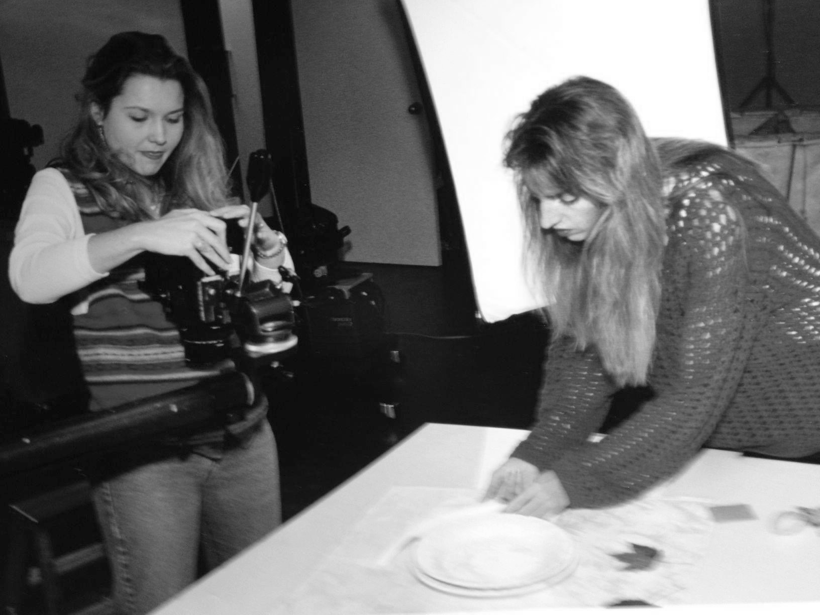
The Dallas Morning News photo studio. Natalie and I are prepping for Thanksgiving. It's been 30 years and my stomach still turns when I see a cooked turkey.
Every so often education experts come up with a theory designed to fix all that's wrong in the classroom. In the last decade, popular buzzwords were "Disruptive Innovation." Educators in the 2010s wanted to be innovators and disrupters and upset the apple cart.
Meh. In the first half of the 1990s, disruptive innovation was the graphic designer’s morning cup of coffee. The infant Internet, rapid developments in technology, email, and newly developed desktop publishing software that turned word processors into graphics processors were every bit as cataclysmic as Gutenberg’s invention of moveable type. We were like the monk scribes who went from doing everything by hand to learning new technologies that would transform every aspect of our profession. Graphic design in the communications field no longer belonged to those with fine arts credentials but to those who embraced technology. You either grabbed a mouse and rolled with the changes or found something else to do.
When I started at The Dallas Morning News news art department, it was a green sea of drafting tables, exacto knives and amberlith. We projected images from film onto a paper form taped to the wall and penciled in instructions to the production room staff telling them how to position the color separations on the page. By the time I left, desks with cube-shaped macs had replaced the drafting tables. Network server rooms replaced composing rooms. We rushed through training in QuarkXpress and every other new software competing for the title of industry standard. I graduated from food pages to designing Fashion!Dallas, travel, entertainment and some news sections. Again, The Associated Press and various press clubs gave me awards, and The Society of News Design published some of my work in its annual journal of the best of the best.
I was invited to teach workshops at The Society of News Design’s annual conference. While there, I visited a vendor’s booth from a little known company out of Silicon Valley called Adobe. They were demonstrating the new Adobe Illustrator software, and I remembered marveling at how you could draw lines connected to anchor points, edit those lines and points and the lines and points would appear on your monitor in real time. The early versions of Illustrator had no preview abilities. You drew outlines and guessed at what the final image would look like once printed. It had maybe six tools, and a limited number of anchor points you could use in one file. Plus, you had to quit out of all other applications before you could launch it. It would be a while before Mac operating systems could handle multiple applications running at once.
For a second time, I was lured away from the newsroom. This time it was the promise of onsite daycare and a comfortable house in the suburbs. At JCPenney’s corporate headquarters, the computer screens got bigger, digital drawing pads appeared and color correction became critical. Here lived a design world beyond newsprint that had no limits to format or paper, other than what the budget or imagination could bear. Once outlawed to newsroom designers by a nervous photo editor, Photoshop became my daily habit. I learned from other designers how to use it; we all learned from each other. Youtube was years away from being invented.
As were PDFs, portable desktop formats. Windows and Macs hadn't learned to talk to each other yet, so designers had to navigate that wall. Presentation skills were essential. The designers in my group would jockey for position on the color printer, waiting for proofs to appear, arguing who had the tightest deadline, then race to the art room to assemble "a comp" (something that simulates the real thing) for showing. We went through cases of spray mount adhesive and didn’t think twice about the carcinogens we were spraying. There was a vented fan in the art room, after all.
By then the Internet, or World Wide Web as it was called, had established itself as a viable format for online sales. Companies like JCPenney worked feverishly to initiate and cement their place online. I and the other development designers worked through many nights on hundreds of prototypes. To keep up, photography went digital, and film processing joined the ranks of other obsolete practices. Photography, like graphic design, shifted away from the fine arts world to those who embraced the new technologies. Access to photography changed overnight from a tedious and expensive process to instant image acquisition. Used to negotiating $1,000 usage fees with New York agents and waiting endless days for a FedEx package to arrive with a single image, I now ordered royalty-free images on a CD collection for a fraction of the cost. It wouldn’t be long before online stock photography companies appeared and downloading an image directly to your Mac would be the norm.
When the 1990s ended, my daily life as a graphic designer looked vastly different from what it had at the beginning of the decade. At no time since has it changed as swiftly and as comprehensively as it did then. Today we’re still using some of the same software, although the learning curve remains a roller coaster. About the time you get a handle on the newest version, the next one rolls out and it's time to relearn. We’re still finding ways to store more and more files. I once paid $3,000 for one (1) gig of external storage. Now I can buy a terabyte (1,000 gigs) of storage for $65 on sale. Art directors no longer need to be at photo shoots. Much of the approval process is done remotely. Many of my former newspaper colleagues have found other lines of work as print journalism gave way to online media channels.
One thing hasn't changed: Washington D.C. in the 2020s is the same mess it was in the 1970s. I continue to read The Washington Post every day, delivered to me by email. One day during my tenure at the JCPenney home office, an editor from The Washington Post called. He offered me a job designing newspaper pages. Food pages.
I turned it down.
Advice to a Younger Me or 10 Things I Wish I Had Known Then That I Know Now
1) Graphic design is a skill, like playing an instrument or sport. It requires daily practice to keep sharp. You didn’t get to where you are overnight. It took years. If you return to it after taking a break to do something else, be patient with yourself. It’s going to take some time to get back into the groove.
2) Everyone does not think like a designer. This doesn’t mean they lack the smarts; they’re just wired differently. Keep that in mind when talking to non-designers. Your goal is to educate them, not intimidate them. Watch out for esoteric language. One day the world will embrace graphic design as the key to a better life. We’re not there yet.
3) Email a presentation or do it in person? In person is far better. Why: Everyone does not think like a designer. Making the presentation in person allows you to bring the other guy up to speed in the problem-solving process that you have been working through. First, remind them of the design challenge that you began with. You’ve been working with it, and they most likely have forgotten your last meeting and quite possibly your name, too. Next, tell them what went into you or your team’s decision-making process and what problems it solves. Last, tell them why your design is the best for the design challenge they gave you. Once you’ve reached this point in the presentation, always ask their opinion. Not a moment before.
Email them a pdf and chances are good they’ll redesign you. And it won’t be pretty.
4) If you can, schedule your big presentations (in person) for 4 p.m. Friday afternoon. Clients are more likely to approve whatever you bring in the closer it gets to happy hour. And if you bomb, there’s always happy hour for that, too.
5) Your teachers knew way more than you ever gave them credit for. When you figure this out, go back and thank as many as you can.
6) Love what you do but don’t love what you do. There will be days when your work is rejected, Michelangelo. If that happens, look upon it as just another opportunity to try again. It’s not that they don’t love you, they do. The death of your masterpiece might be due to any number of factors: budget cuts, similarities to another concept, commitment issues with leadership, trouble at home. Who knows? You don’t. Stick it in your portfolio and move on.
7) There will be days when you have to blow a deadline. Life happens. Know how to blow it without losing a client or pissing off your boss. Waiting until the last minute to call your client never works. And always call them – never text or email bad news. If your client has taken an interest in your day-to-day life, don’t confuse this for actual interest. They really don’t care that you’ve been up all night with a sick child. They care about their project. It’s far better to tell your client that you’ve had a last-minute brainstorm/flash of brilliance for another direction and could use a few extra hours to flesh it out. What they hear is “this designer is really working hard for me. I’m going to get good stuff out of this.” Then, if you did #4 and scheduled your big presentation for 4 p.m. Friday, that buys you the weekend to do something wonderful. Or at least get some sleep.
8) Be nice to your coworkers, even the interns. Especially the interns. One of them will help you get a really good job later on.
9) If you want to stand out, look at what everyone else is doing. Then do the exact opposite.
10) There are some people you will want to avoid in your career. One is the project manager who thinks they are an art director because they missed the lecture on how to work with creatives. Try to prove them wrong and you are guaranteed nasty emails from your supervisor. The only way out of this one is to deliver exactly what they ask for and nothing more. At the end of the day, remember that your client or project manager or creative manager sits in the decision-making seat, not you. Your control over the design process is limited to just how much creative freedom they’re willing to let you have.
Put your best efforts into doing work for those who respect your ability enough to trust you with design decisions and you’ll both be happier with the end product and your relationship.